In Sync
Work
When we had our initial client kickoff with Todd Richardson and Luke Jarrett, they strutted into our office with the self-confidence of a pop-sensation, chart-topping, heartbreaking boy-band. But that’s not how we came up with their company name Synchronicity (mad props to *NSYNC tho).
We love giving the new kids on the block (intentional boy band reference) a leg up in the business world. So, when Todd and Luke, owners of an experienced land architecture and urban planning firm, came to us for a new name and branding help, we jumped right on it. Actually that is a lie. We straight up walked across King Street with a 6-pack because they happen to be our awesome neighbors.
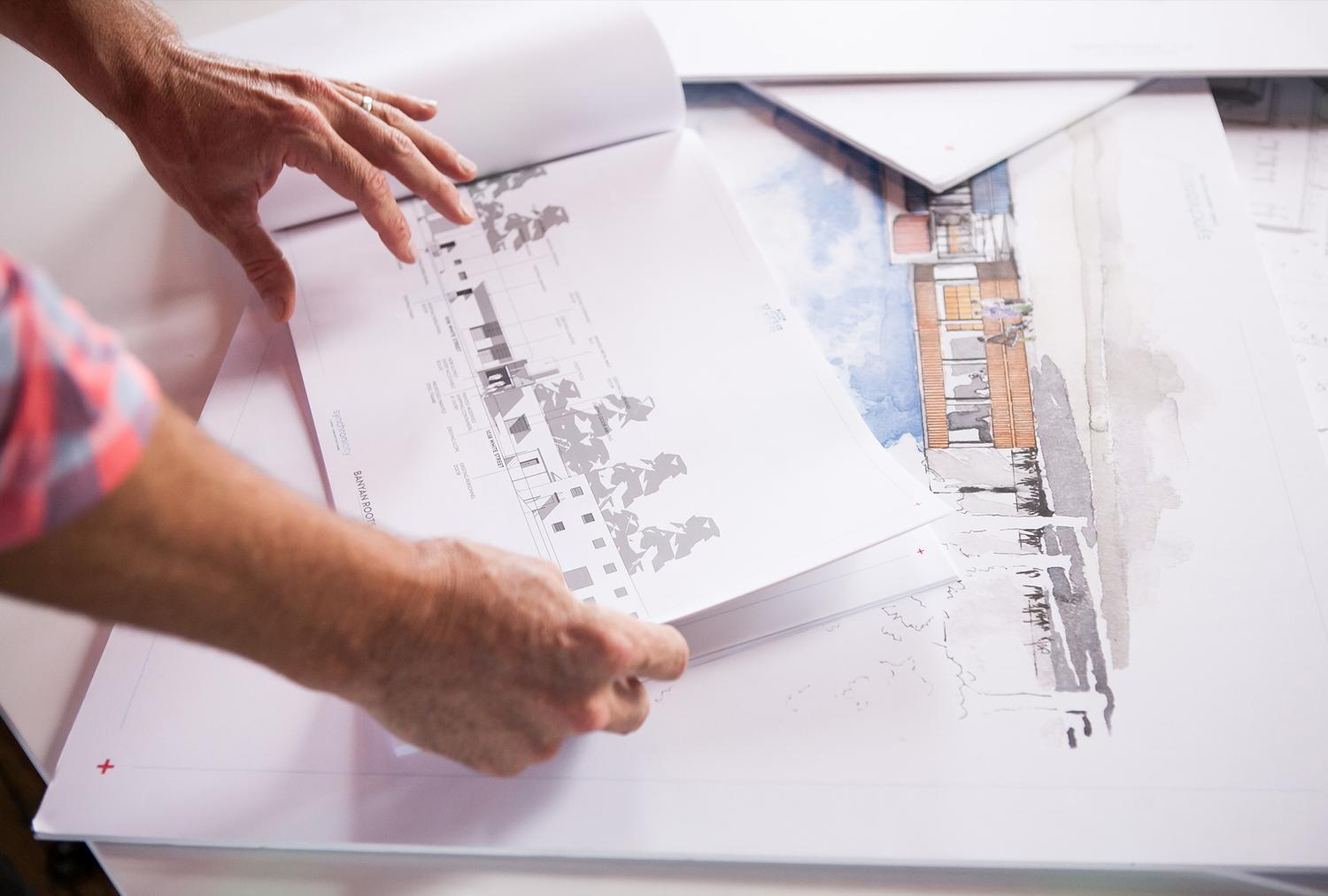
The first project was re-naming this unconventional design firm. With a strict vision in mind, we wanted to stress their goal of establishing a balancing act between architects, the city and its citizens.
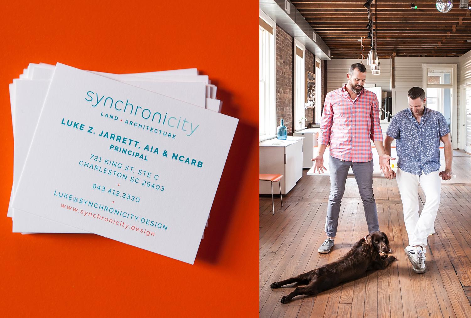
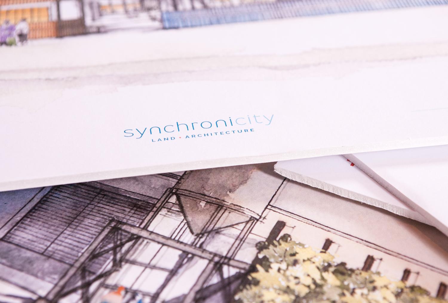
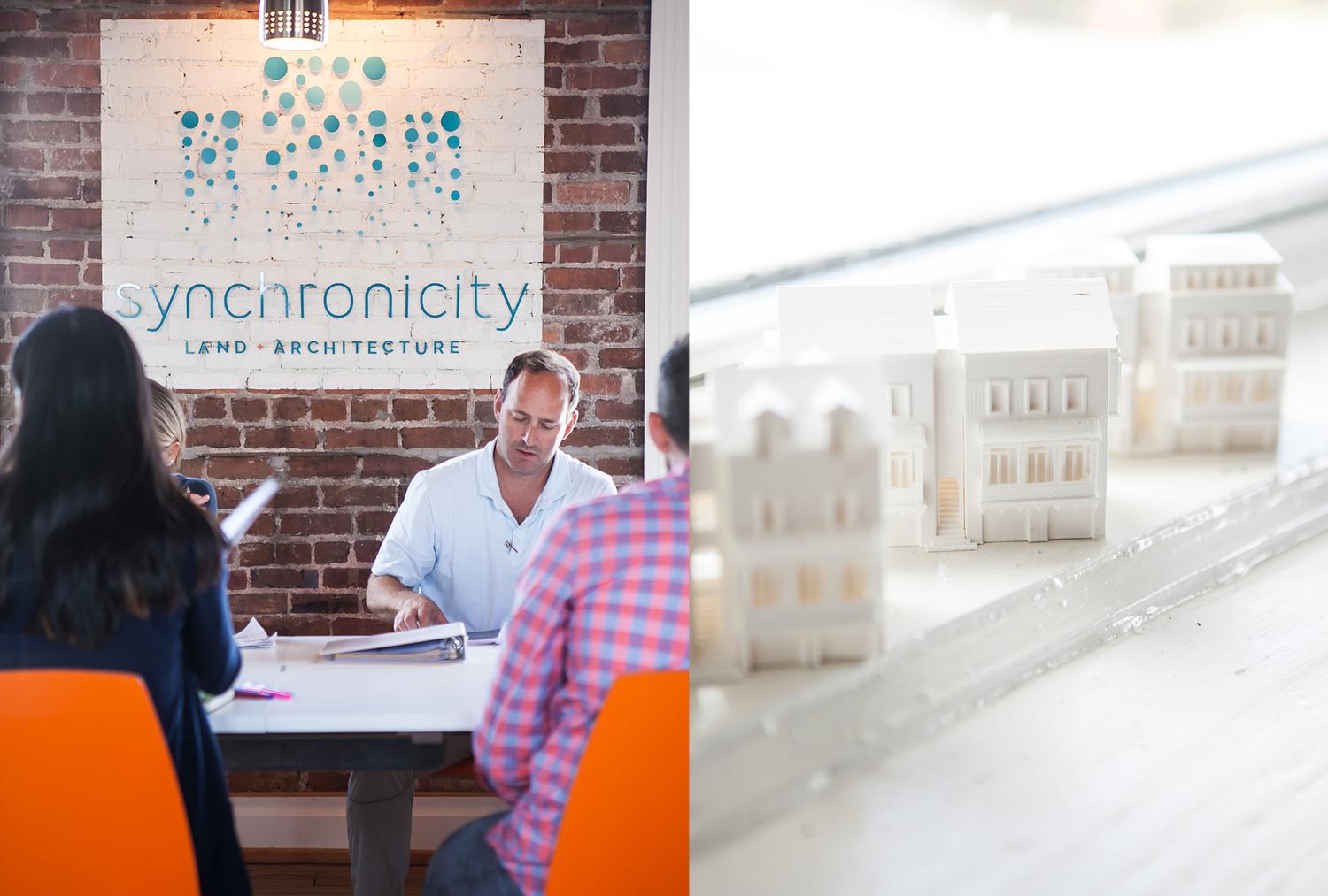
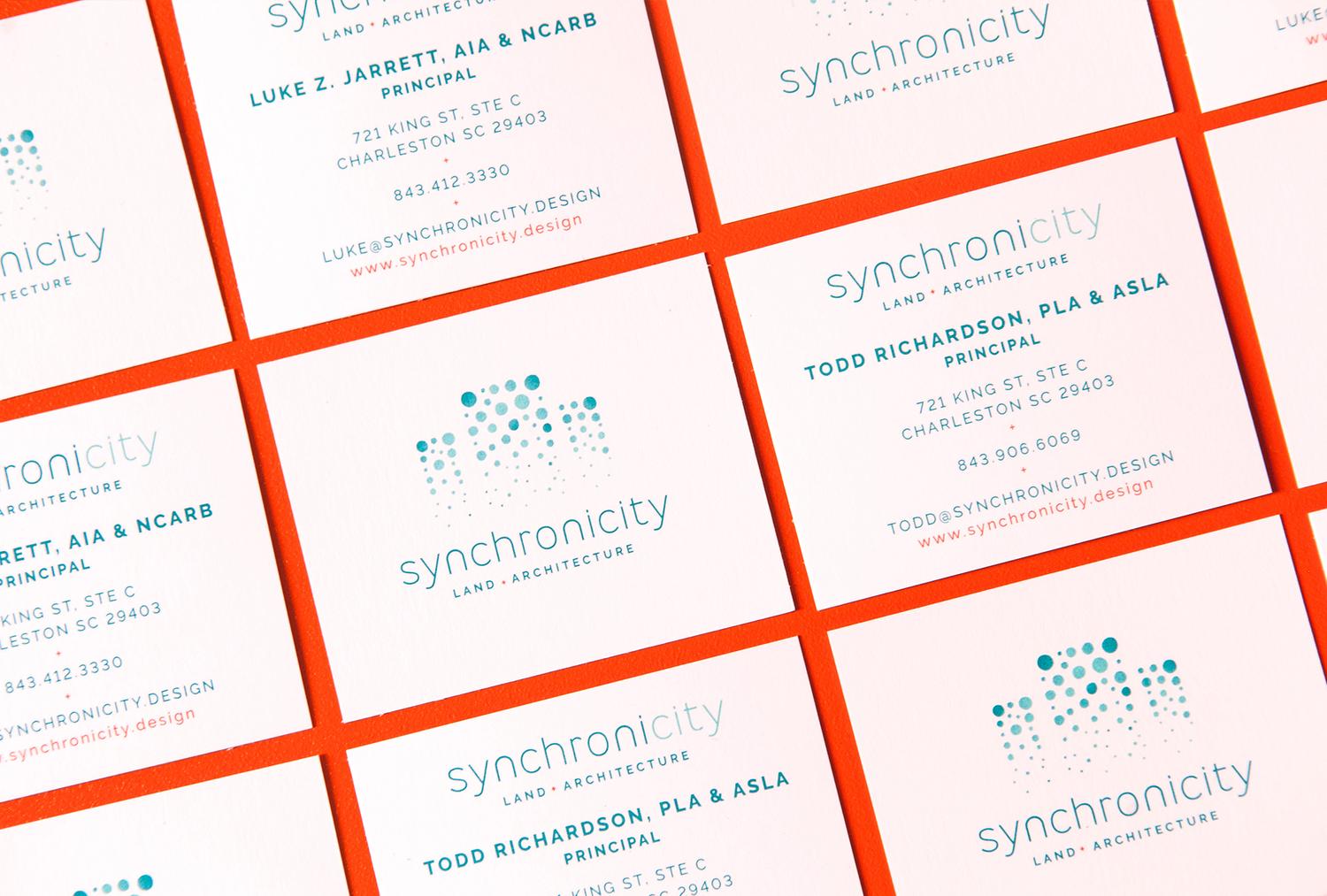
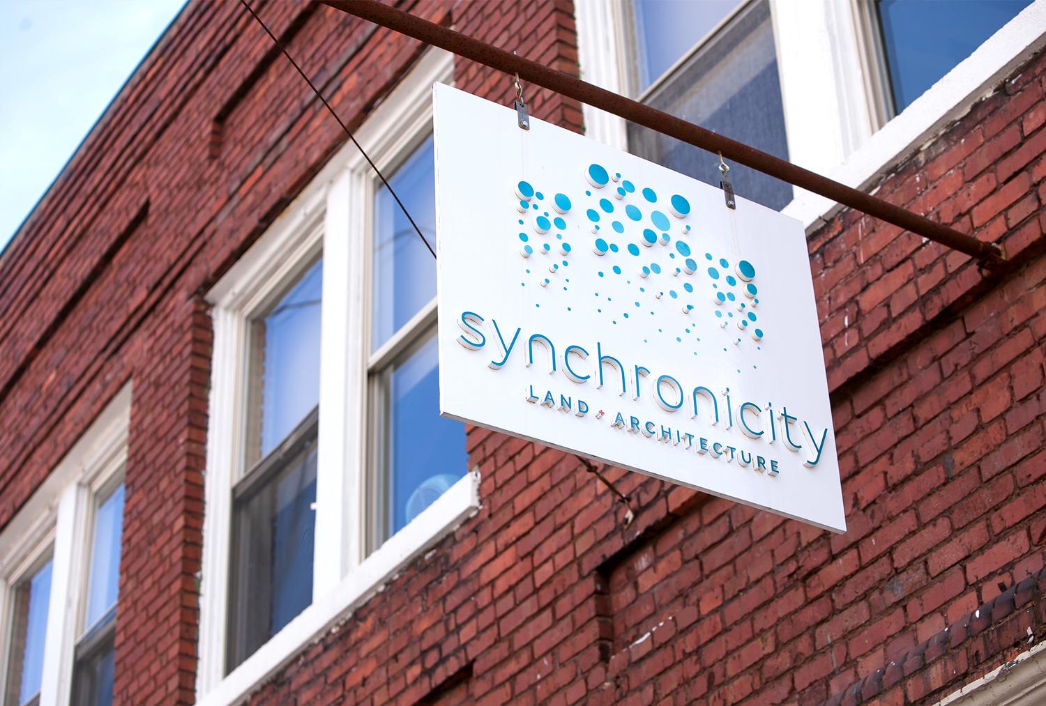
This collaborative effort is where we got the inspiration for the name, Synchronicity. Get it -- synch, collab, city. For the execution, we focused on their vision: a modernized and improved Charleston. The logo is an illusion of a traditional skyline, made up of dots to represent twinkling city lights. A big message packed into a clean design.
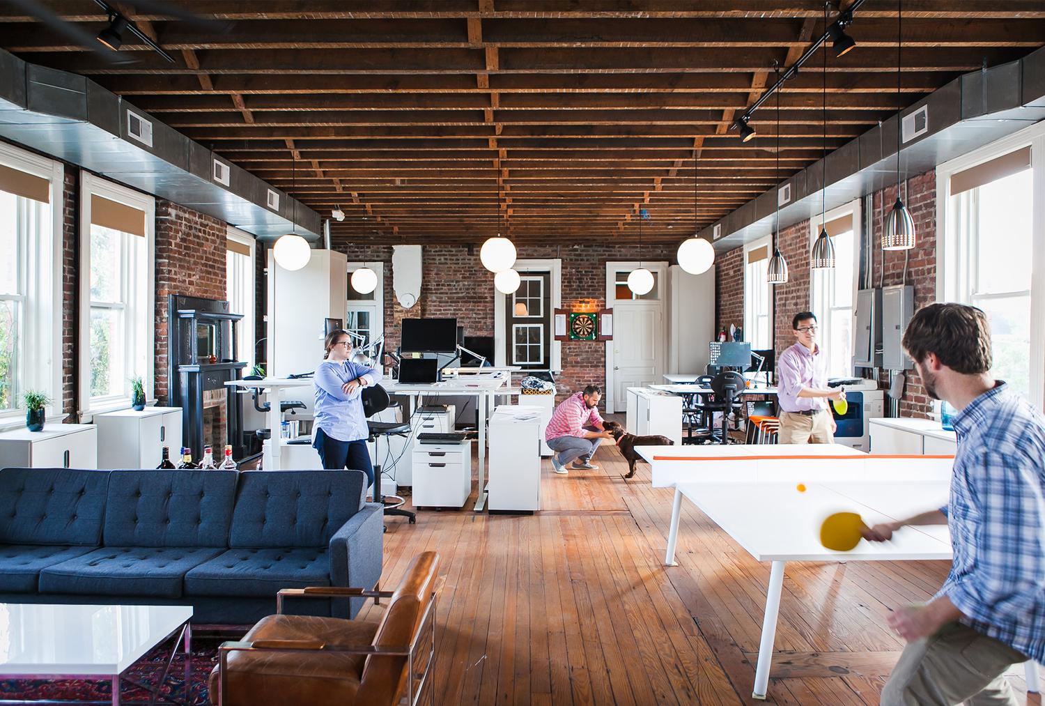
Every inch of this branding project was targeted to market Synchronicity as the company for the improvement of urban spaces in Charleston. While we already think the 843 is pretty great, us OMies were amped to be a part of this movement and help Synchronicity keep on keeping on.
Check out the pictures below to see the logo and branding suite we put together.